Bidnis Cards!
Ok, so I have it narrowed down to 2 possible card designs.
Design 1 is more simple and clean, easy to read. I think it looks professional and I'd be happy to go with it.
Front
Back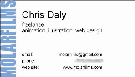
Design 2 is a lot more fun, I think. Also, I'm planning on making a Flash version of my website in which I hope to incorporate the Molar character. Some of the colors on this are just placeholders, and the heading needs to be spiffed up a bit, but I wanted to get it up for comments now that it gets the jist across.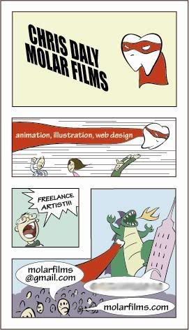
So there they are. I'd like to get them going pretty quickly, but I'm have a lot of trouble deciding! If anyone has any likes, dislikes, comments, criticisms, or anything else they'd like to share, please let me know!
![]()

2 comments:
my "trading card" got a really good reaction. i think the comic book is a good concept. but think about readability. you might want to make one side the cover. and the other panels with the info. so it's not so cluttered.
do the little price and stuff in the upper left corner and put a tooth up there.
maybe even an old style ad: link 1
link 2
or maybe something like a get out of jail free/chance card from monopoly, except instead of a "?" you have the tooth.
2 color print on blue, matte finish.
eh...i guess this guy thought of that already [dman it!]
but you could do it in an original way where he just ripped it!
link 3
Post a Comment